- Web design
- SEO
Stress-free website redesign checklist


In a digital landscape full of choice, loyalty is no longer built on brand names alone—it's earned through seamless, intuitive experiences. UX (User Experience) isn't just a design buzzword; it’s a major player in how customers feel, engage, and return to your brand.
Done well, UX makes users feel confident, satisfied, and valued. Done poorly, it pushes them straight to a competitor. Let's break down how thoughtful UX design fosters long-term loyalty online.


Do you really
need a redesign?
Before you spend time and money, ask yourself (and your stakeholders) these questions:
- When was the site last redesigned or thoroughly updated?
- What’s not working and what is?
- What business goals is the site not hitting today?
- Where are the leaks in the funnel (engagement, conversion, retention)?
- What does success look like in the next 3-6 months?


Then decide on the scope: full redesign, focused facelift, or targeted features. If your site is already fast, scalable and on-brand, you may just need better content organization (Information architecture), sharper messaging or fewer steps to checkout. A total tear-down isn’t always needed nor the smartest move.


Website redesign sanity check
If you say “yes” to several of these, you may be right and a redesign is probably worth it:
- The site doesn’t look good on your iPhone
- Pages load slowly, especially on mobile
- Navigation is cluttered; people can’t find key content
- Mobile layouts break or feel cramped/awkward
- Messaging doesn’t clearly explain what you do
- Checkout feels clunky / causing drop-offs
- Competitors’ sites do more (or do it faster)
- You’re scaling ad spend, but the site can’t keep up
When a redesign actually pays off
A. Increase site speed: more conversions
Optimizing your site for speed can drive big wins and have tangible results. In a Google/Deloitte study, trimming just 0.1 seconds off mobile load time lifted conversions by roughly 8–10%—and also nudged up average order value and pageviews. That’s small technical work with outsized business impact.
Web.Dev Google/Deloitte Case StudyWhen teams prioritize site performance and Core Web Vitals, the gains can compound. Rakuten 24 reported double-digit improvements in conversion rate and revenue per visitor after improving LCP and related metrics that everyone can discover through Google’s Insights tool.
This is clear proof that site performance ties to revenue.
B. Higher search rankings
Consider where your visitors actually are: as of September 2025, most web traffic is mobile: about 58% worldwide (StatCounter Global Stats). If your site isn’t mobile-friendly or it lags, customers are going to head over to your competitors.
Google uses mobile-first indexing, which means your mobile content is the primary version used for indexing and ranking (Google for Developers). If the mobile experience is weak or slow, your rankings will suffer. No matter how good your site looks on desktop.
C. Accessibility and
ADA compliance
Accessibility is increasingly non-negotiable. Across North America and Europe, companies are expected to make the web usable for everyone, including people with visual or hearing impairments. Fall short and you risk complaints, lawsuits, and fines. Get ahead of it, run an ADA check and fix the gaps sooner rather than later.


Plan the work
(so you don’t redo it)
Write success in plain language. For example:
- Increase mobile conversions by 20%
- Help first-time visitors understand our offer in 10 seconds
- Grow qualified leads by 30% without more ad spend
- Achieve ‘Good’ Core Web Vitals on key pages
With outcomes set, keep scope tight. Work and update the few pages, features and templates that can actually move those numbers.
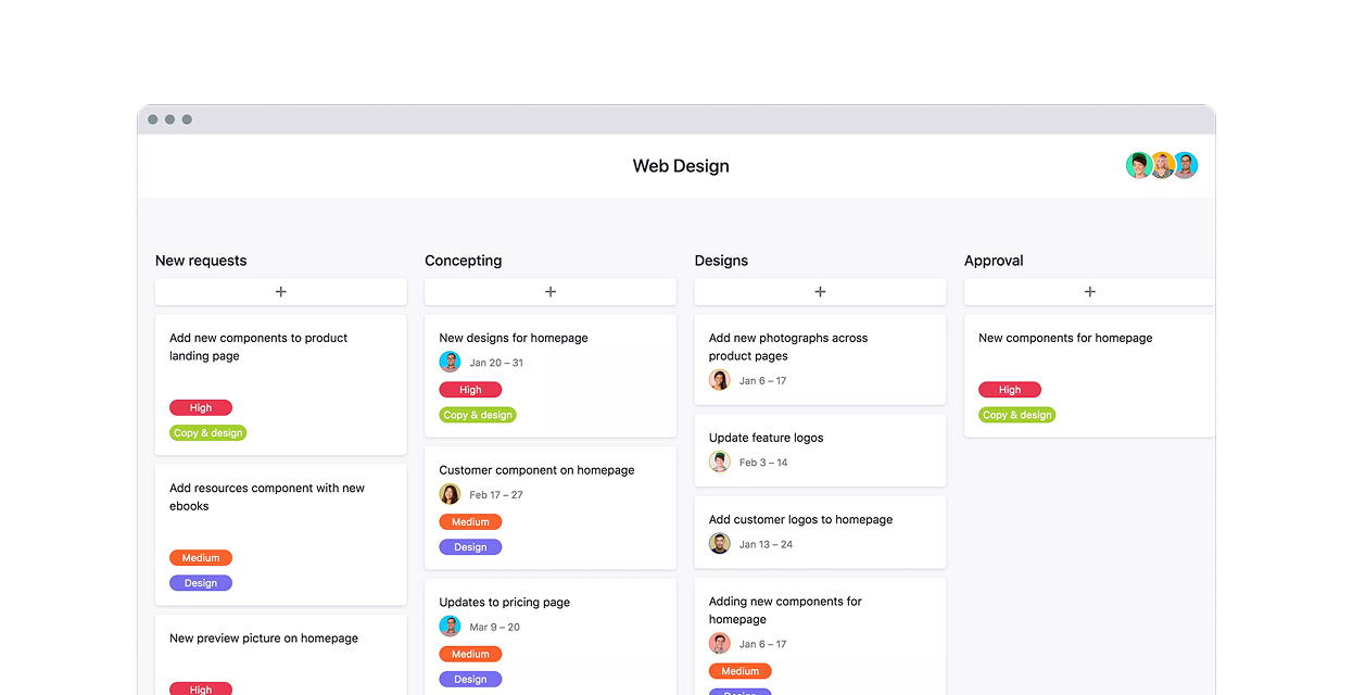
If you have a team capable of makes these changes, the right tools are important. Use what your team moves fast in. We like Figma for collaboration, but if your workflow is quicker in Framer or even annotated screenshots + Miro wireframes, do that. The fastest route to feedback and deployments wins.
Design where
it matters most

Do the heavy thinking in design, not code. Put your mockups in front of real people: existing customers or, better yet, prospects. Ask them three simple questions:
- What is this?
- Why should I care?
- What would you do next?
If any answer isn’t obvious, fix the design now. It’s far cheaper than changing and re-doing later.

What to prepare at this stage:
- Brand guidelines + guardrails (type scale, contrast, imagery guidelines)
- Content structure + nav map (how people actually find things)
- Responsive wireframes => high-fidelity comps for your core templates
- Copy samples (headlines, value props, CTAs, form and button labels) that are scannable, not too wordy
Built for speed
and scale
Performance
Serve modern image formats (WebP/AVIF), right-size assets, lazy-load below the fold, and keep JavaScript lean. Set a performance budget per template and hold the line.
SEO Foundations:
Clean URLs, descriptive titles/meta, sensible structured data (organization, product, article, FAQ where it helps), and internal links that actually guide users and crawlers. One H1, meaningful subheads, and copy people can scan and skim through.
Accessibility:
Treat it as a design constraint, not an afterthought. Adequate color contrast, helpful alt text, visible focus states, forms with clear labels, error messaging, and keyboard-friendly interactions.
Launch without the “OH SH!T”
Right before go-live, slow down for a calm final pass:
- Redirects mapped and tested for all changed URLs
- XML sitemaps and robots.txt are correct
- Analytics and pixels firing (and not duplicated)
- Forms, checkout, and error states validated end-to-end
- Real-device checks on top pages (not just automated tests + CI/CD)
After launch, watch the first 72 hours very closely. 404s, logs, Core Web Vitals on key pages and early conversion signals/analytics. Over the next few weeks start to measure against your baseline and keep trimming friction and optimizing.
Have a rollback plan ready if early data shows conversions or other critical metrics dipping.

Small wins compound
Redesigns aren’t a finish line; they’re a reset. Keep a lightweight backlog of ideas—copy tests that clarify decisions, navigation tweaks that cut steps, performance trims that reduce wait time, and checkout refinements that remove hesitation. Ship the small stuff often; it compounds.