- Web design
- UX/UI design
- Web dev
- Mobile dev
- SEO
- Email marketing
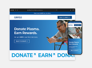
A better donor
experience for Grifols Plasma
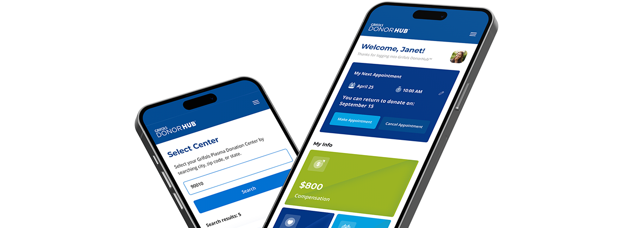
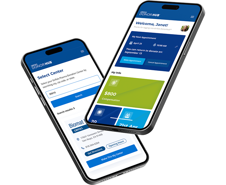
Grifols Plasma runs at scale; the donor journey needed to feel simpler. We mapped the flow, rebuilt center finder and booking, clarified eligibility and prep, and shipped a fast, component-driven site that works on every device. Easy to understand, easy to book, easy to donate.
Pharmaceutical Manufacturing
1909
Large (20K+ employees)
Global
Barcelona, Spain
Complex journey,
no attribution
Ready donors, tangled flow: a heavy locator, fuzzy eligibility, and a third-party booking handoff—especially rough on mobile. Tracking died at the handoff (UTMs lost, no cross-domain), so campaigns couldn’t be tied to appointments.
Our solutions checklist:
- Locator + booking redesign
- Eligibility flow + prescreen
- Mobile-first UX/UI
- Modular CMS components
- Plain-language content + FAQs
- Speed + Core Web Vitals
- GA4 cross-domain + UTM preservation
- Accessibility (WCAG) + SEO foundations
Donor-first flow.
Clean data and tracking.
We cut clicks and confusion. Donors get clear guidance and fast booking on mobile; your team gets a site that’s easy to update and data that ties campaigns to confirmed appointments.
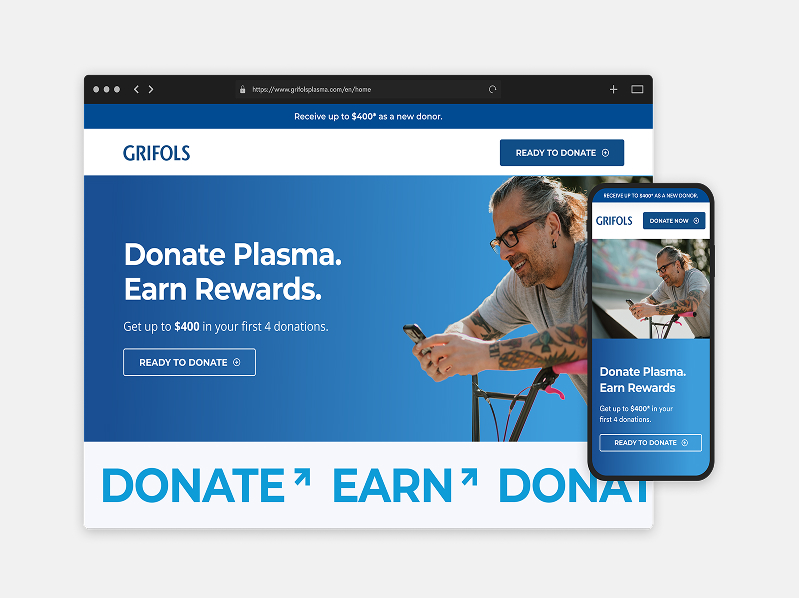
User-centric design
We developed a fully responsive website designed to deliver a seamless and engaging experience across all devices, ensuring consistency in functionality, aesthetics, and usability for users, whether on desktop, tablet, or mobile.
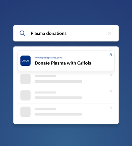
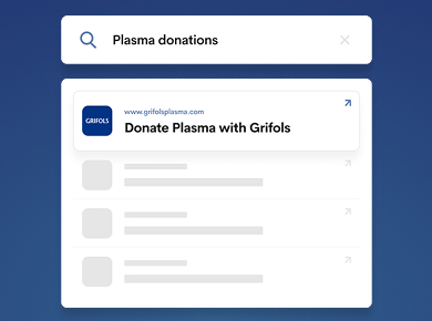
Boosted SEO rankings
We closed structural, content, and authority gaps, aligning the site to real search intent and elevating high-value pages, so people searching for plasma donation land on pages that answer their needs and convert.
- Optimize content: targeted keywords, clearer answers, stronger on-page structure.
- Fix technical basics: crawl/indexing, canonicals, XML sitemaps, structured data, CWV.
- Local where it matters: location/center pages and listings tuned for discovery.
- Strengthen authority: selective outreach for quality backlinks; reclaim unlinked mentions.
- Measure + iterate: GA4/GSC dashboards to refine what works.
Non-branded search clicks
Increase in site traffic
Increase in form submissions
Increase in on-site events
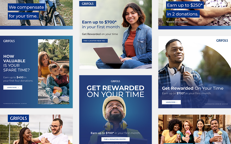
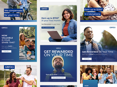
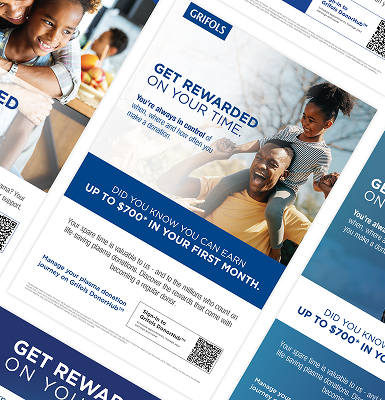
Social feed that drives appointments
Value first, steps second. Paid and organic posts highlight time, eligibility, and compensation ranges, then deep-link to the right page. Consistent design, short captions, and UTMs keep the path clear and measurable.
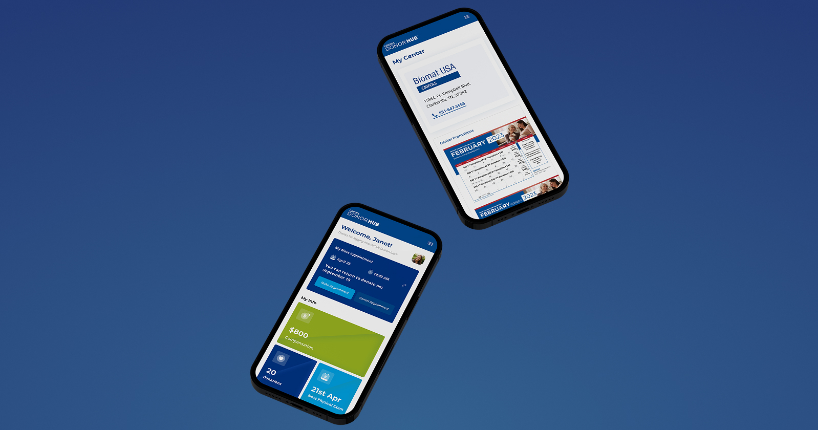
Seamless mobile experience
Built for thumbs. The locator, eligibility, and booking steps are quick, readable, and tap-friendly. Pages load fast so donors can go from search to scheduled on a phone.
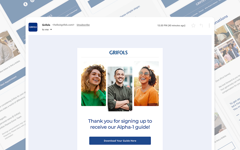
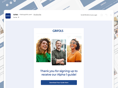
Inbox to appointment
Campaigns run on reusable blocks in Salesforce CMS: offers, center updates, FAQs, so marketing can ship without dev. Automations trigger at the right moments (first visit, abandoned booking, post-donation), and every send rolls up cleanly with cross-domain tracking and a simple preference center.
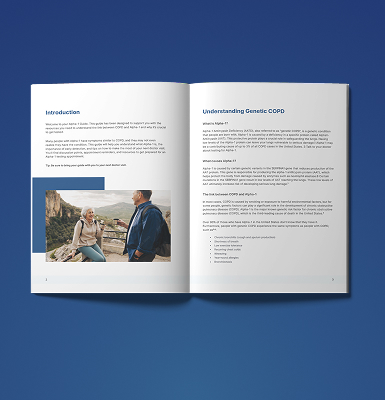
Posters, guides, on-brand
We developed visually engaging, informative guide booklets, posters, and other print materials that align with the brand identity, ensuring clear communication and a cohesive donor experience across digital and physical media.
Solutions guide
1/6
From intent
to donation
From first tap to appointment, fewer steps and clearer choices. Bookings up, drop-offs down, and end-to-end attribution shows what actually drives donations.
+30% more liters of plasma donated
Measured during our engagement vs. the previous period. Lift driven by higher booking completion and repeat donors.
Over 70% loved the new app
Post-appointment survey shows most users preferred the new experience for speed and clarity.
+16% appointment conversion rate
Faster mobile flow and plain-language guidance turned intent into scheduled visits.
-20% locator booking drop-off
Streamlined steps and deep links kept donors on the path to book.
-12% fewer no shows
Reminder and prep automations helped more donors arrive ready.