+150% qualified leads in year one
Making the website match the company behind it
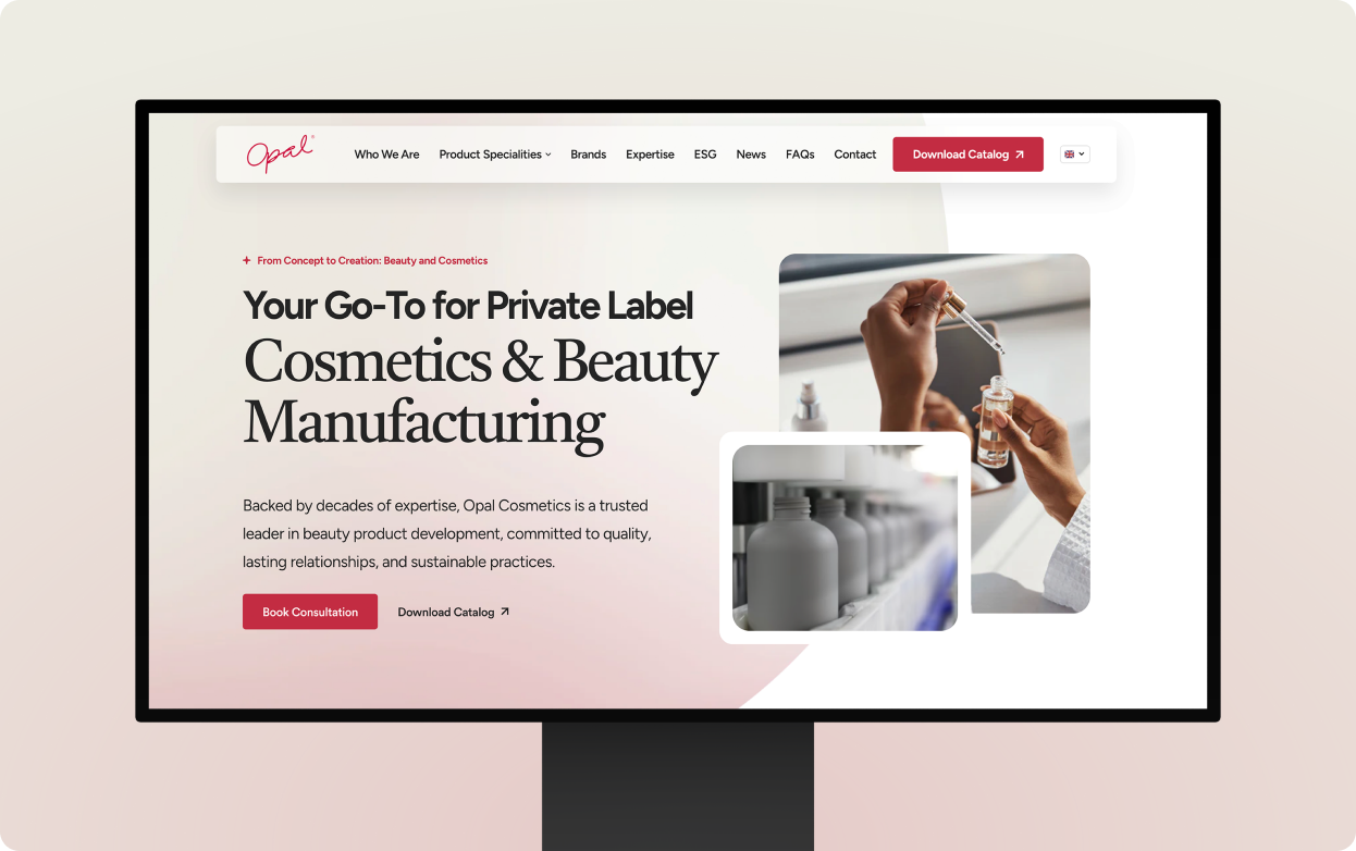
Opal Cosmetics has been manufacturing for beauty brands since 1994. Almost none of that showed on their website. We turned a dated, non-responsive site into a multilingual platform that makes the company easier to understand, trust, and contact.
Cosmetics manufacturing
1994
Large (1,500+ employees)
Hong Kong
+150%
Overview
The website was the first proof buyers saw
Decades of manufacturing gave Opal a deep product range, in-house R&D, patents, certifications, and global production. For buyers evaluating them, the website was the first proof of all that. And it wasn't carrying the weight.
Before anything else, the site had to answer the questions every buyer arrives with: what does Opal make, can they handle the scale, why are they credible, and how do I get the catalog or start a conversation?

Challenge
The website made a 1,500+ person company feel small
The old website had the basics, but it was not built around how serious buyers evaluate a manufacturing partner. Beauty brands, private label teams, and international prospects arrived with the questions, and the site made them work for every answer.
There was no catalog to request, and the product pages were short lists. The credentials that close manufacturing deals were scattered or missing. Chinese buyers got a separate site, years older, that looked like a different company entirely. And none of it worked on a phone.
Opal looked smaller than it was.
Built for serious buyers
We rebuilt the site around how buyers decide. Here's what that included:
- Visual identity overhaul
- A clearer path through the catalog
- Rewritten sitemap and site content
- Obvious next steps on every page
- A Shopify backend the team already knew
- Five language versions for global buyers
Visual identity overhaul
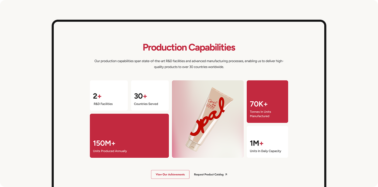
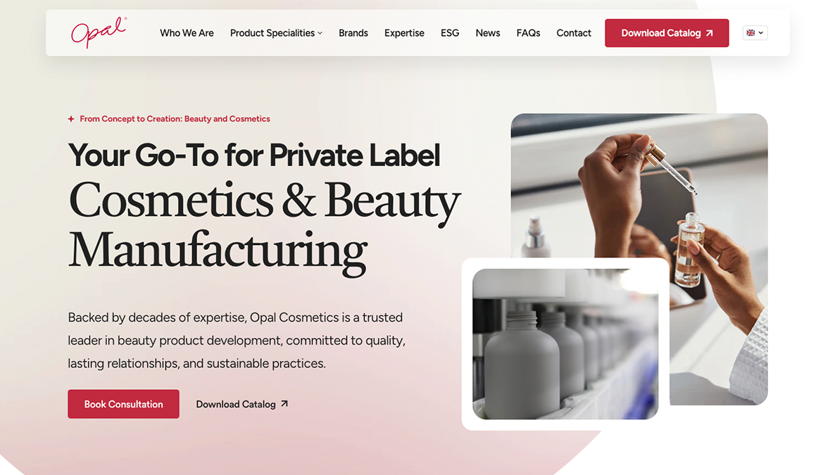
We rebuilt Opal's visual system to look like the products it sells. Custom icons give every category a face, production numbers get the display treatment they earn, and every page follows the same hierarchy. A buyer's first impression now reads as a company of scale, not a template.

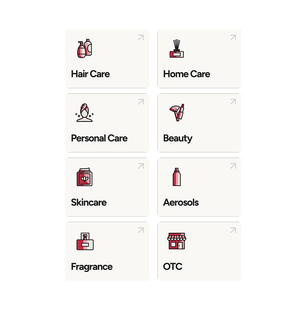
A clearer path through the catalog
We restructured, renamed, and combined product categories so buyers understand Opal's range faster. Each category now works like a sales page instead of a list: private label buyers get a path built for them, every product shows what can be customized, and Opal became easier to buy from.
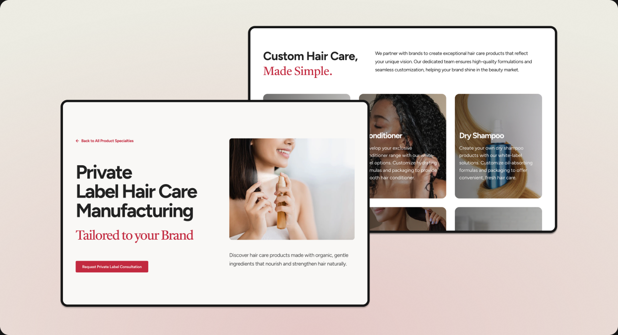
Turning scattered content into a stronger story
We wrote the new site's content, working from the old website, client notes, and internal material. Facts that were buried became proof buyers can find: production numbers up front, the manufacturing process laid out step by step, and a blog that answers the questions prospects search before choosing a manufacturer.
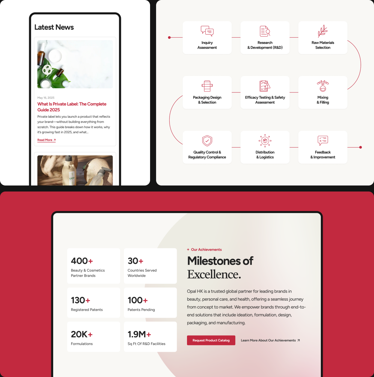
Making the next step obvious
Buyers come to this site to do one of two things: get the catalog or start a conversation. We built a direct path for each. Download Catalog sits in the nav on every page, desktop and mobile. Contact forms live on the pages that do the convincing, not behind a Contact link. Nobody hunts for the next step.
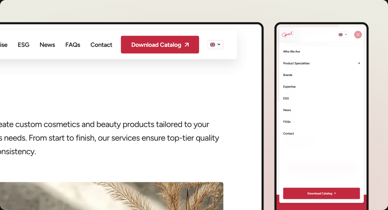
A familiar backend for a growing global site
We built the site on Shopify because Opal's team already knew it. They manage products, collections, media, and content themselves, no developer required. And once the English site proved itself, we expanded it into four more languages, so a buyer in any market now sees the same company.
The website gave campaigns a strong place to land
Opal's campaigns were already running before the redesign. What changed is where they landed. Traffic more than tripled in year one, qualified leads followed, and the website now matches the company behind it.
Site traffic in the first year after launch
Qualified leads from the website, first year after launch
Languages added after launch
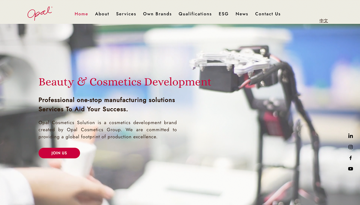
before
after



The website’s readability has improved significantly. Even collaborating clients have praised the site for its aesthetic appeal and well-structured content. Lifted Solutions Inc.’s high efficiency and prompt responses were impressive.