- Branding
- Web design
- UX/UI design
Modern brand. Clean site.
Better experience
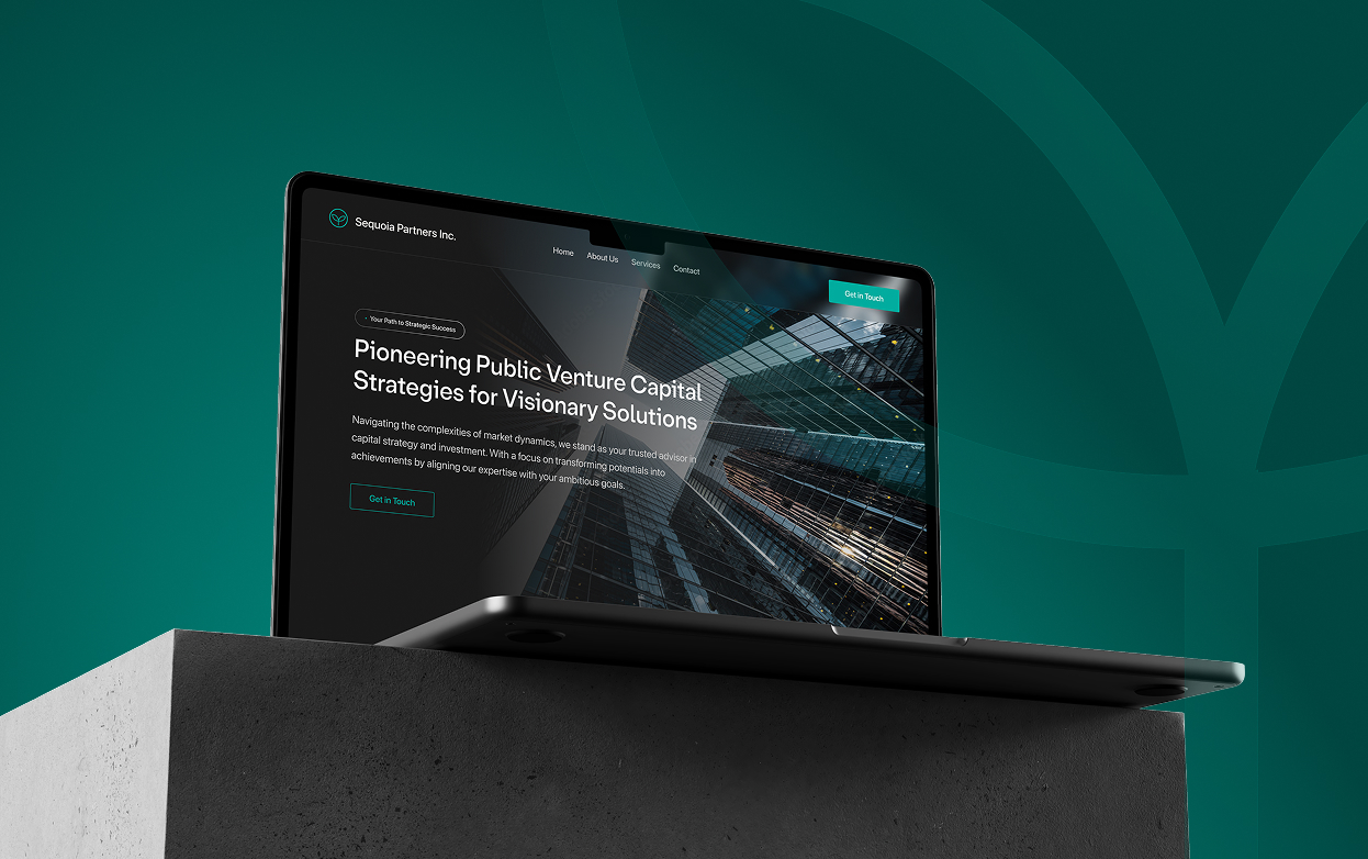
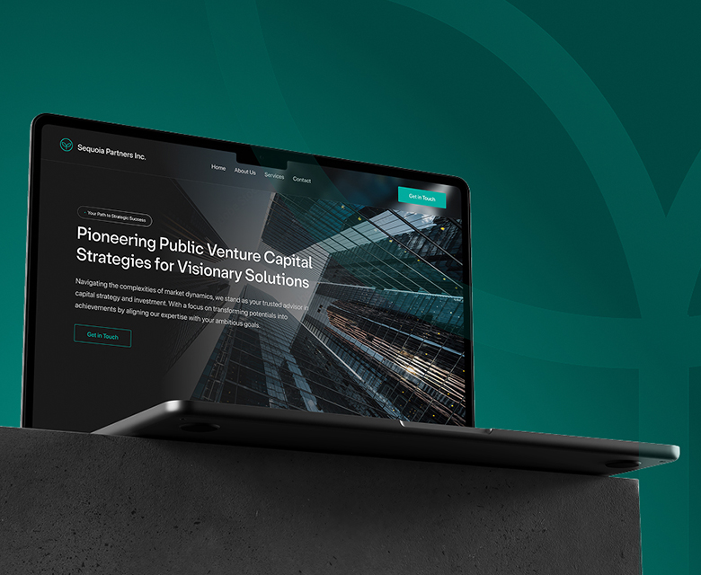
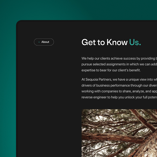
Sequoia Partners helps growth-minded companies access and navigate public venture markets. We refreshed the identity and rebuilt the site so offerings are easy to scan, pages load fast, and booking a call is obvious on every screen.
Financial
2010
< 5
North America
Vancouver, BC
Sequoia’s brand
and site, modernized
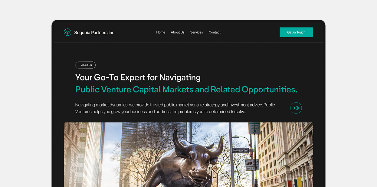
Capital markets guidance, explained simply. We modernized the brand, tightened the story, and shipped a fast site where services and sectors are easy to scan and getting in touch takes seconds.
Time to rebuild,
not repaint
The web didn’t match the work. Mixed messaging, uneven design, slow load, and no obvious next step. Rebuild from structure up, surface service offering, and make contacting Sequoia simple.
Our solutions checklist:
- Brand refresh + guidelines
- Timeless web design
- Mobile-first UX/UI
- Clear service messaging
- Lead flow: forms + booking
- SEO foundations
From patchwork to
a clean, credible site
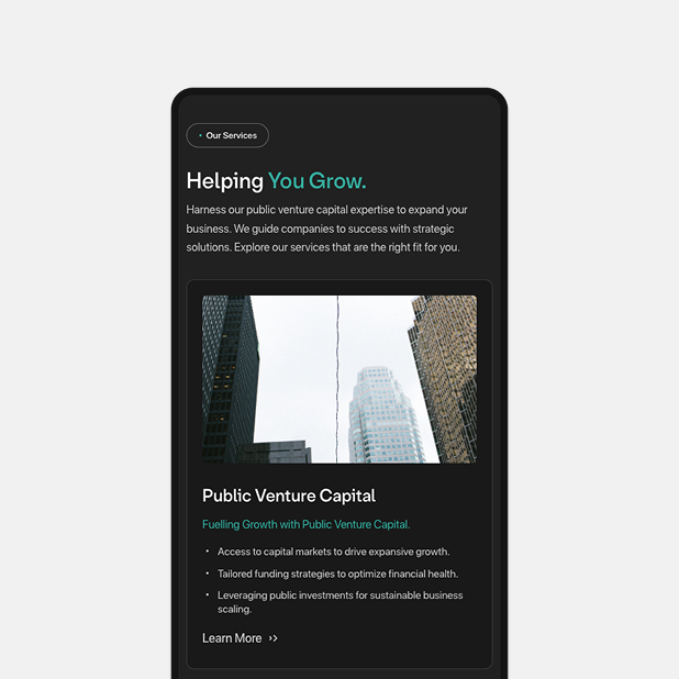
We rebuilt the experience around how founders decide: service pages that act like landing pages (value, who it’s for, outcomes, proof), a lean nav, and consistent CTAs.


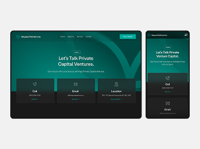
Designed for every device
Built once, looks great everywhere. A flexible grid, fluid type, and responsive media keep the site crisp on phones, tablets, widescreens, and high-DPI displays.

Content overhaul
Rewritten with purpose: less jargon, clearer headlines, consistent voice. Duplicates consolidated, proof added where it counts, and templates set for services, sectors, and insights.